
3am yap sessions
KKB has been here all along. It finally outgrew the spreadsheet.
I'm the friend who offers to pay first and volunteers to do the math. This is the story of the app that took over the job — the problem underneath it, the questions that shaped it, and the decisions I'd make again.
 Rafael Dytoc· July 20, 2026 · 16 min read
Roles: Product Designer, Design Engineer, Full-stack Developer, Motion Designer, Sound Designer, Brand Designer, Copywriter, Product Manager, QA and Dogfooder, Customer Support.
Picture the end of a lunch-out: the bill arrives, everyone reaches for their phone calc, and I'm already tapping my card for the whole table. The receipts come home with me.
Call me weird but I love working with numbers and I love spreadsheets. Give me a chaotic pile of receipts and I will genuinely enjoy turning it into tidy rows with formulas and a total that reconciles to the tee. Every barkada has a designated math person… It's me, “Hi!” 👋
And I took the sheet seriously. Our group's favorite eat-out is Tori-Tori, and every visit produced a fresh group of rows in the same sheet: one row per dish per person, quantities like 0.5 when two of us split the spicy salmon sashimi, the Grab fare split by five of us was entered as 0.2.
Then the formulas: each person's subtotal computed as a percentage of the whole order, so service charges, group discounts, and extra fees weren't split equally but weighted by what you actually ate. Order 23% of the food, pay 23% of the fees, get 23% of the discount.
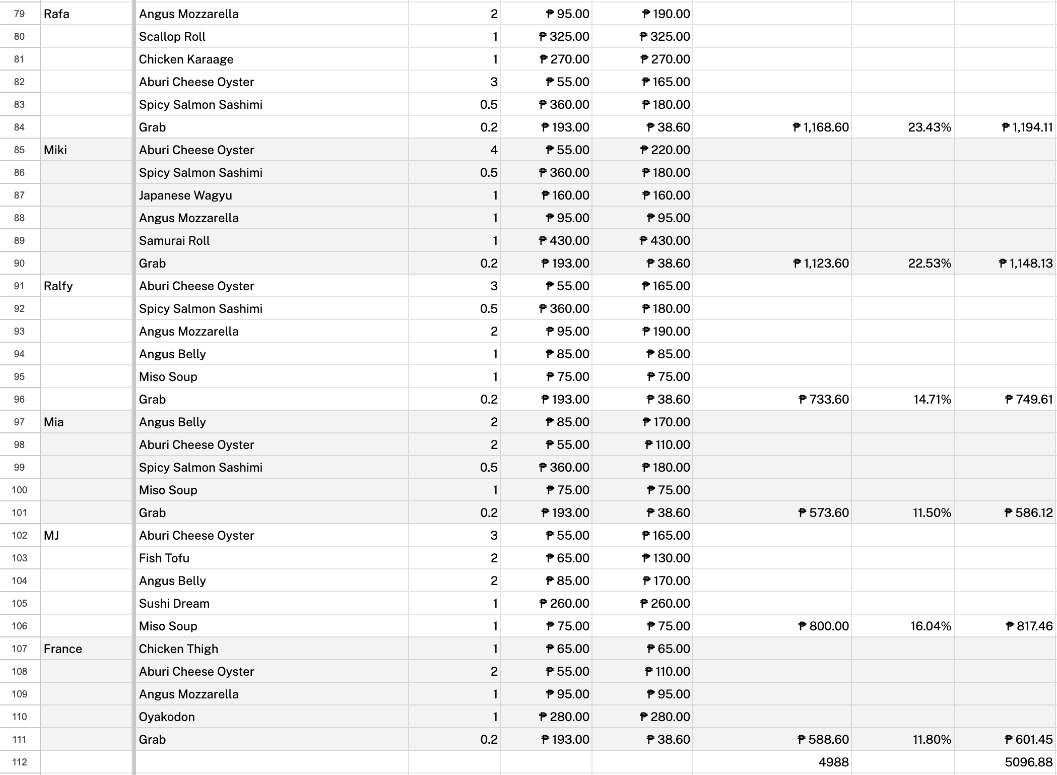
It worked — but it was fragile in ways only I could feel. Re-keying every line from a paper receipt is prone to typos, so I reconciled the totals against the receipt every single time. And transparency wasn't optional: the moment a friend asks , you'd better be able to show exactly how the math works.
Nobody actually opened the sheet, though. Friends waited for me to upload a screenshot of their final amounts — followed by my second ritual: multiple screenshots of every e-wallet and bank QR I own, so everyone could pay wherever they preferred.
So this app wasn't born from hating the work. It was born from noticing how much of the work was never math at all. The sheet could compute everyone's share, but only I could show it. The showing, the sending, and the proving all still routed through one person. That's the ceiling of a spreadsheet: it only really works for the person holding it.
There's Splitwise, of course — a good app that never quite fit how we split. My bills were almost always one-off dinners, and Splitwise is built around groups. When other ran it, someone else was in charge, and I was the designer in the corner, redesigning the app in my mind. The feature my group actually needed — itemized bills — lives in the Pro tier, and it happened to be the exact thing my sheet already did. (Pro includes plenty more — receipt scanning, unlimited daily expenses, currency conversion, expense search — and in fairness, KKB doesn't have most of those yet either. But it has the one that mattered to me and friends, and it comes out of the box.)
The idea had been crisping up on the backburner for a long time — a someday project I kept almost starting. What finally got me to start was my August calendar: two out-of-town beach trips, weeks apart, with two different . Two piles of receipts, two sets of people who'd owe each other money, and a real deadline. I couldn't even wait for August — four days ago, I declared the weekend a personal hackathon, so I drafted the core features and started building.
the-first-prompt.md
Let's plan for a new project.

I want you to research the core functionalities of group
expense splitting apps. Give me a comprehensive comparison
on the core functionalities included in their free tier and
paid tiers. I'm not so sure if I want to create a mobile app
at the start or do I first want to have it as a PWA, and we
build it mobile-first.

This project will start for friends and family first. So
maybe we can look into testflight release. My requirements
for the project are to be able to create groups/invite
members into a group. The group usually is an event, hangout,
a weekend vacation. Basically, this is going to be the
communal space where people log what they paid for the trip
that's going to be split by the group.

- Maybe it's not necessary for people to have accounts, maybe
  they can generate a code, add a name, and join a group.
- I want to be able to upload ways in which the person
  wants/can get paid. Like having their QR codes on their
  profiles.
- I want to be able to upload receipts so there's official
  proof for the transaction that was made. Though the app
  doesn't need to have the tech to be able to turn
  unstructured data from a picture/receipt into structured
  data for logged payments in the app. That's probably a nice
  to have.
- A niche case, but I want to be able to have a specific
  use-case for restaurant/eat out transactions, being able to
  add line items, and select specific people who are sharing
  on a specific item.

For the design and animations, I want you to refer to my
skills-library repo, invoke the skills related to web
animations and design engineering whenever I ask you to
review the code before pushing changes to production.

In terms of technical requirements:
- I'm good with having it deployed on Vercel and using Neon
  as a database. But will this be the case if we decide to
  make this into a mobile app instead of a PWA. I want to get
  the pros and cons for this one.

Success for me looks like: my friends and I using this for a
real dinner — the bill logged in the app instead of my
spreadsheet, and everyone paying without asking me how much or
where to send.

My considerations are I just want to have something to use by
the end of the month.

If you have any questions that you want to clarify, please ask
before you start anything. If you need more context about this
project, and what my requirements are for this project, let me
know as well.The insight that started the project: nobody was asking for a better calculator — they had me. What was missing was a way to remove the social cost of having between friends.
The actual pain of splitting bills is emotional, not arithmetic: the discomfort of chasing a friend for money, the guilt of owing, the fear of seeming petty for reminding someone. That's what KKB is really built to remove. The math is table stakes. The feelings are the problem.
KKB — . The name set the design direction more than any moodboard: this is an app for the group chat crowd, in their language, for their payment rails (GCash, Maya, bank QRs), in pesos by default.
The prompt got things started, but the product wasn't shaped by a spec. It was shaped by a handful of questions — most of them arriving mid-build.
ill do the math tomorrow
An actual message from our chats, and the core loop of the app. One person pays; the app carries the debt so no person has to. Under the hood, every expense is stored the same way — for each person, what they paid and what they owe. An equal split, an exact amount, a fully itemized dinner: different ways of arriving at the same two numbers. Even paying someone back is recorded like an expense, just flowing the other direction.
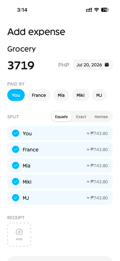
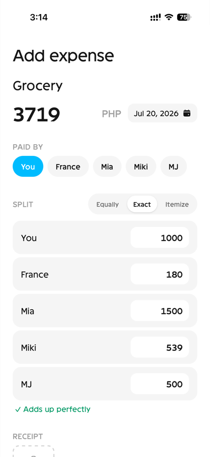
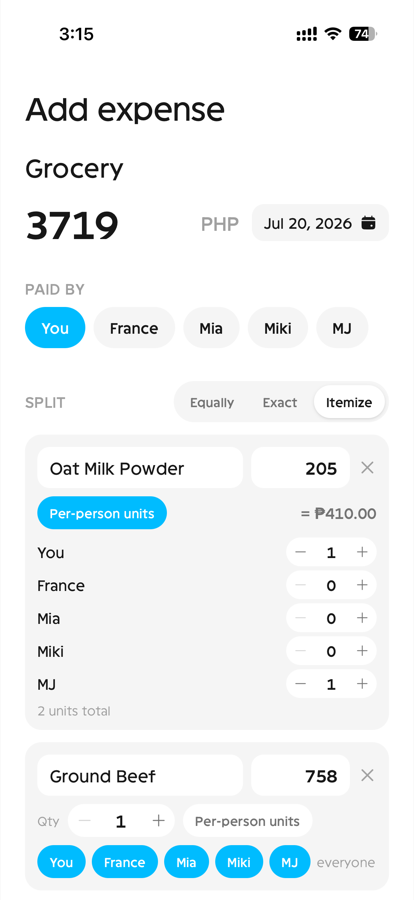
wait who ordered the extra rice 🍚
Itemized bills are KKB's centerpiece — the Tori-Tori spreadsheet, turned into an interface. Add your orders, tap the names, and extra fees distribute proportionally, exactly like my weighted formulas: you pay for what you ordered, not for what the table ordered.
Designing this split editor — live per-person preview, member chips per line item — took longer than any other screen: design it, try it on a real bill, see what makes sense at an actual table, redesign, test again. It earned every round.
but what if i'll just eat out with some friends, i don't need a group 😅
Sponty didn't come from a message — it came from scrolling my own sheet. Almost every KKB entry I'd ever made was a one-off dinner, not a trip. Those don't deserve the ceremony of a group. The core principle: if you don't need to make a group to make it work, the better.
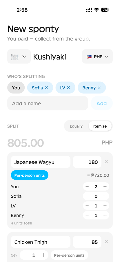
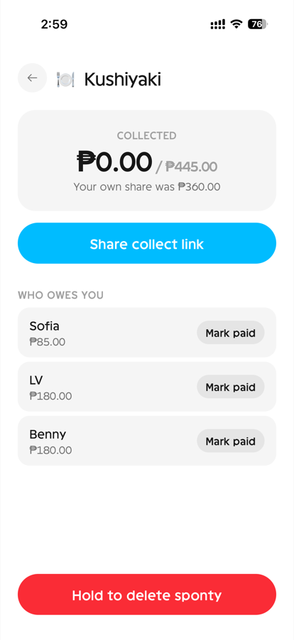
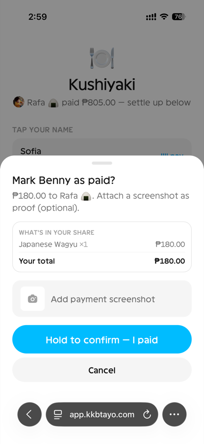
So: log the bill, share one link. Friends open it, tap their name, see their share, and pay — no account, no install, no sign-up wall between your friend and your money. An app like this only works in real life if the person paying you back doesn't have to do anything first.
please join the group na so we can start logging 🫠
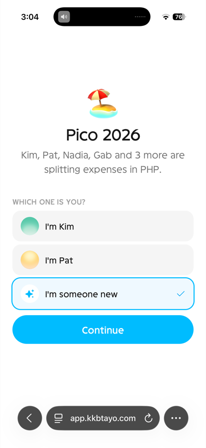
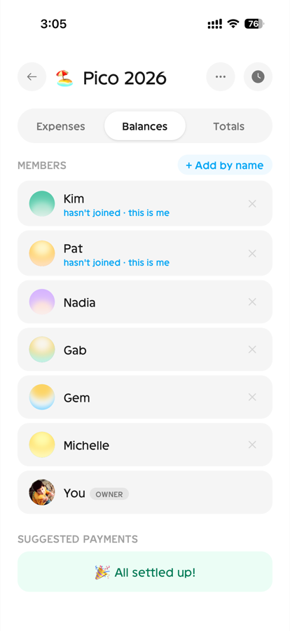
In real life, the spending starts before everyone's joined. So KKB lets you add friends as names first — log Miki's share of the bills before she's ever opened the app — and when she arrives, she claims her name and inherits her whole tab. The app bends to the norm, not the other way around.
nadelete ko yung gcash number mo send ulit 🙏📱
rafa bumped his message
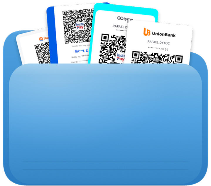
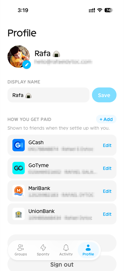
The most re-sent message in any Filipino group chat — and the reason every split of mine used to end with five QR screenshots. In KKB, payment methods live on your profile and appear automatically right where a friend is about to pay you, with tap-to-copy numbers. The five-screenshot ritual became a one-time setup: save your payment deets once, and never think about them again.
how do i keep my friends' data safe 🔒
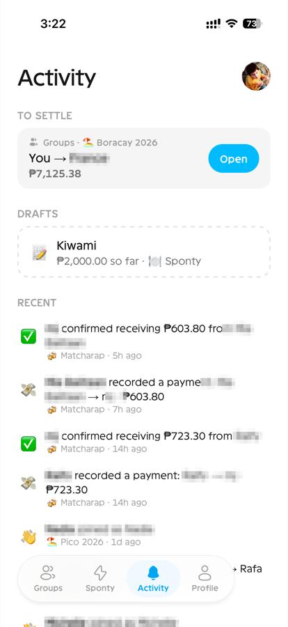
Privacy became a rule, not a feature. What you log is visible only to the people you split with — no public profiles, no discoverable groups. Payment numbers and QRs never sit on the open web — they only show up behind sign-in, or on links your barkada deliberately shares. Nightly backups are encrypted before they leave the database.
The other half is protecting the app itself. Passwords were the first thing to go — sign-in is a one-time email code, so there's no password to leak, reuse, or forget. Every code and email send is rate-limited, so the sign-in form can't be turned into a spam cannon and one bad actor can't drain the service for everyone else. For an app that knows exactly who owes whom, trust might be the most important feature I design. (Please don't take that as a challenge — I will see you in the logs. 👀)
KKB is where I let myself play — every screen was an excuse to try an interaction I'd been bookmarking and saving. But even a playground needs house rules, and mine are small on purpose:
- One custom ease-out curve shared by everything
- Durations between 160 and 320 milliseconds
- Springs saved for the playful moments
Every animation has to explain something — where a drawer came from, which tab you just left, what a number changed into. Everything is interruptible mid-flight, and delight is reserved for moments that warrant that oomph: confetti fires only when an entire group settles to zero.
Collected
₱0.00 / ₱2,450.00
the barkada is paying — keep scrolling
The press
globals.css
/* globals.css — one custom curve shared by everything */
:root {
  --ease-out: cubic-bezier(0.23, 1, 0.32, 1);
}

/* Universal press feedback: unlayered, so no component
   can accidentally bring its own timing */
button:active, a:active, [role="button"]:active {
  transform: scale(0.97);
}
button, a, [role="button"] {
  transition:
    transform 160ms var(--ease-out),
    color 160ms var(--ease-out),
    background-color 160ms var(--ease-out),
    opacity 160ms var(--ease-out);
}
The entrance
✨ Hello, I popped in
globals.css
/* globals.css — success cards, menus, fresh rows */
@keyframes kkb-pop {
  from {
    opacity: 0;
    transform: scale(0.96);
  }
}
.kkb-pop-in {
  animation: kkb-pop 300ms var(--ease-out) backwards;
}
The spring
Hover me — I bounce
features-carousel.tsx
// motion/react — the landing cards' hover language
<motion.div
  whileHover={{ scale: 1.03 }}
  transition={{ type: "spring", stiffness: 320, damping: 12 }}
/>
To keep myself honest I audited the whole app with skills that encode Emil Kowalski's design-engineering philosophy, then executed every tier of findings. The five review lenses:
- His component-polish principles
- An animation vocabulary check — are the right curves and spring parameters doing the right jobs?
- A strict review checklist for performance and accessibility
- A hunt for missing animation opportunities
- A tuning pass over the animations that already existed
The part I enjoy most is introducing delight to interactions that don't usually get any. My favorite: the hold button. Important, hard-to-undo actions — deleting a group, settling a debt — usually get guarded by a confirmation pop-up, and pop-ups train people to click “yes” without reading.
KKB replaces the dialog with the gesture itself: press and hold, and a colored fill sweeps across for about a second while a haptic pulse quietly accelerates, like the button is charging up. Let go early and it snaps back instantly — deliberate on the way in, forgiving on the way out. One interaction instead of two, and you can feel exactly what you're about to do.
Hold to confirm — try holding, then try letting go early
Tap to copy
The app shipped to production in week one and met reality immediately. The first bill ever logged in KKB was dinner with two high-school friends after boxing. The app needed a little handholding on its first live run, but the loop closed: I dropped one link in the group chat, and I was paid back within a day. No follow-up messages about how much, or where to send, or screenshots as proof — the app carried all three.
Day two was the ultimate stress test: lunch with a group of ten. Bugs I'd missed surfaced within the hour:
- Signing up through an invite worked, but signing up cold was broken. Nobody had ever arrived at the app without a link before.
- Proof-of-payment uploads went missing for friends who weren't logged in. Sponty doesn't require an account, so I missed that edge case.
- And I was half-anxious live, because one refresh meant losing a half-entered itemized bill and re-asking ten people who ordered what. That fear shipped as a feature the same day: drafts.
The whole v0.3.x release line is basically that lunch, patched.
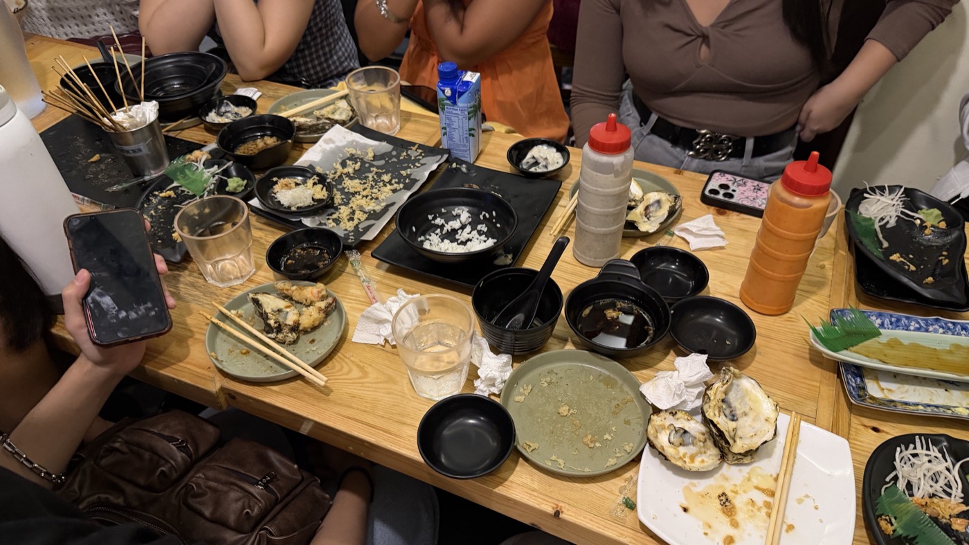
I went home with a full belly, and a fuller heart. The best feedback wasn't even the compliments — it was watching a friend discover some details I planted the night before and realize it was built that way on purpose. And the funniest: friends saying they couldn't wait to go out and have spendings just so they could use the app again. The bill-splitting app, giving people a reason to rack up bills. HELP 💀
A caveat, in the spirit of honesty: dogfooding is not automatically the right design process. Your sample is people like you, some friends are too kind to complain, and what works for one says very little about everyone else.
For this project, though, it felt exactly right. I'm genuinely the target user — this problem lived in my own group chats for years, so nothing got lost translating research into intuition. The feedback loop ran at the dinner table, in the exact context where the product is used, with real money on the line. The whole app is one small ritual repeated often, so a single meal exercises almost all of it.
And the stakes were friendly: a bug in v0.3 cost me opening my eyes wide 😳 and saying “woops, I'll fix that later when we get home!” When the audience grows past people who eat with me, the process will have to grow up too.
Here's the part I didn't say out loud at the start: I could have paid for the subscription and called it a day. The paywall was an excuse. KKB is the first product I've ever shipped.
By day I'm a product designer, and for the past five months I've been working agentically — designing with AI agents in the loop. I'm stepping into a role where I'm expected to mentor and accelerate AI adoption across the company I grew in for the past 5 years, and I didn't want to teach any of it from theory. I never felt ready but it made sense because I read somewhere that being ready is a decision, not a feeling. KKB was me dipping my toes first.
I'm writing this before the app has even debuted beyond close friends and family, but one shift is already unmistakable. Designing starts at “I want this feature.” Shipping reveals everything that feature needs to exist.
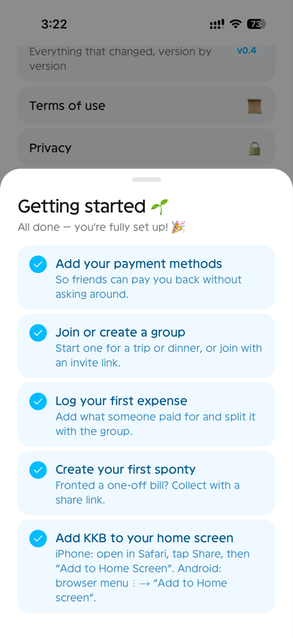
- Saved payment methods means accounts. Accounts mean authentication. Authentication means a database and emails that actually send.
- Proof-of-payment photos mean storage, and storage means compressing every image before it uploads.
- Share links mean public pages, and public pages mean deciding exactly what a stranger is allowed to see.
When my projects lived only inside Figma, nothing ever needed hosting. And as a designer I would never have thought about rate limiting — but as the person shipping, protecting the app from abuse was suddenly my job too.
There's a more personal layer to it. For years my work ended at handoff — other hands made it real. That's how the craft is supposed to work, and it says nothing about what design is worth. But privately, I always discounted the value I bring because I never got to see anything through on my own. Building KKB end-to-end was the first time that feeling had nowhere to live.
It also settled how I feel about AI. It isn't taking the job — it's forcing a level-up. The agents now do the part I used to be proudest of, the pixel-detail component work, which pushed me into the parts I'd always avoided: vision, research, product thinking, constraints. Orchestrating well means staying on top of what the agents can actually do — if I don't know what they're capable of, I can't ask for the right things. What's left for me is the deciding. That turned out to be the bigger job.
It's also why the roles floating at the top of this page aren't a joke. I can claim them not because I did every job by hand, but because every call in each of them was mine: what animation each screen deserves, what sound a button should make, how every interaction should feel.
I didn't come up with all of this on my own, either. I lean on skills published by creators I follow on X and the component libraries they've built, then modify each piece until it matches this project's brand. And I've always been a collector of my friends' wishes — this time I finally got to build them.
Looking back, the decisions that mattered all did the same thing: they made it easier for the other person to take part. Links over invites. Names over accounts. Saved payment deets over re-sent numbers. I came in obsessing over the tiny details: the pixels, the motion, the polish. What this project taught me is that in a social app, every ounce of friction you remove for the other person comes back to you as the product actually getting used.
The goal from the start was to not overengineer. But not overengineering is different from skipping the table stakes — so if the app feels like a lot for a v0.4, every piece of it was born from a comment, an insight, or a complaint from someone who actually used it mid-dinner and hit a wall.
I'll miss the old ritual. For years I had an ever-growing Google Sheet whose tab name was, literally, KKB. Now KKB is the app — and it's not only mine anymore. The ritual didn't die — it's just a redirection. Instead of re-keying receipts, I listen to users, extract their pain points, and prioritize the backlog. It only gets better from here, and I'm excited about that.
Success, for now, is simple: friends using it without me present. I'll admit to one fear: that it grows faster than what I've built can handle. I started this through the lens of family and friends, and I want every new person's first open to feel exactly the way theirs did — not a buggy one because the servers can't keep up anymore. We'll see. If I ever monetize to keep up with covering the costs of this project, the promise is that the features that make sense stay free.
I don't know that much about shipping yet, but friends sharing their works to the world, like Pauline with her Digibouquet, and Alexis when he started his badminton queueing app, inspires me to do the same. To make apps that make sense and that people we know would actually use.
And the biggest lesson is about the backburner itself. We carry ideas for years while they rot — losing context, losing the details we used to obsess over, losing the very spark that started them. The idea in your head is always harder than the thing actually is once you start. And the process — designing and building from the ground up, watching each feature fall into place — turns out to be the fun part, the best part.
Thank you MJ, Mi, Ralfy, Miki, Alexa, Mia, France, Bella, Kir, Gab, Kurt, Sofie, Mom, Dad for testing and using the app out on its pre-debut stages! 🩵